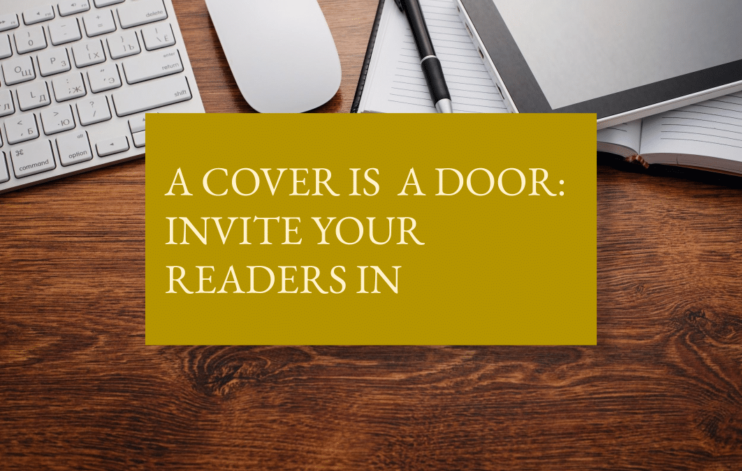
You’ve finished writing your novel and are excited to share it with readers, but before you look for reviews, bloggers, podcasts, or book clubs to get the word out, take time to consider your cover. A great design will entice readers to click on it or pick it up whether the book sits on a shelf or is displayed on a website.
I’d like to suggest you think about your book as an invitation to a wonderful shared meal. The cover serves as a door to the party, giving readers a feeling about what they’ll find inside—a formal do with candles and aperitifs, a raucous music-filled soiree, or a casual back-yard barbecue.
As to the actual design, preparation can make your vision concrete. For those self-publishing, that vision will guide you or your designer; for those with a traditional publisher, you will have less control. However, it can’t hurt to communicate with the design team about the cover of your dreams.
Before we look at six aspects of your cover, a small assignment to focus your thoughts. Jot down five adjectives that describe your book and tape them on the wall where you can see them. Then give yourself a new mantra: three seconds. That is the amount of time readers scanning for a new book spend on each cover. Three seconds to catch an eye, to be memorable.
Image
While you were writing, you may have imagined your main character on the cover, a historical figure perhaps, or a woman comforting a child or a suave man in a tuxedo. Or perhaps you pictured an important object like a queen’s seal or a bent fork.
First ideas can be the best, but before deciding, take some time to explore.
In your browser, search for books like yours, i.e. “Renaissance novels” or “Historical Romance.” Copy the covers you love and paste them into a document. Now scan the display, asking yourself these questions.
Does a visual theme stand out? For historical fiction, the figure of a woman in period dress facing away into the book’s location has been popular. The popularity indicates that it sells, so you may want to join the crowd. Or you may choose a different path. Either can be right. One note: if you search online for a perfect image, keep in mind the copyright. A little care can save you heartache.
Do you like faces or objects? Abstract images or reality? Allusive or direct? There’s no right or wrong, just a sense of what makes visible your story.
Note, it’s perhaps best to avoid AI generated images. Many readers sense them and will find them inauthentic.
Write down your answers, then compare them to your list of adjectives.
Do you write historical fiction?
Join our email list for regular writing tips, resources, and promotions.
Color
Now go a step further. The next time you’re in a bookstore (that’s often, right?), take a look at the spines. Are they all black? Hard to read? Because chances are your book will be shelved at some point, spine out. Don’t lose your advantage.
Choose two colors, write them down, and compare them to your adjectives.
Font
Match the various looks to your adjectives. If you don’t see any fonts that suit, repeat the exercise, adding books to your list.
Movement
Your story isn’t static. There’s tension, the characters change, events propel the plot forward. So the cover should likewise move.
If your chosen image has inherent motion—a dancing flapper, a warrior with a sword—lucky you. If it’s a face, tension can be inserted by pushing the face close, partially screening features, or angling and cropping the image. A swipe of unusual color can also add tension, as can the placement of the title.
You may want to add a couple of cover examples to your page to express this.
Size
Instagram’s sizing can be difficult, and if you want an audible book, those designs are square. Being aware can save later difficulties.
Back
Make it delicious. Easy to digest. In other words succinct and colorful. Start with your best elevator speech—a descriptive couple of sentences you’d use to hook a reader in a brief encounter between floors.
Add praise and/or reviews. Despite the recent decision by Simon and Schuster to forego blurbs, they can be helpful if well chosen.
Finally, spice up all the verbiage with a couple of small images that reflect the front. A tuxedo tie; a graceful silhouette.
Your time has been well spent; you now have a list of adjectives, sample book covers, image types, colors, fonts, and verbiage to give your designer. Or to use yourself. These are merely guidelines. Let creativity flow.
Wishing you excellent sales.
Terri Lewis fell in love with medieval history in college. Not the dates or wars, but the mysterious daily lives. She studied & visited Europe’s old towns and castles. Finally, two sentences in a book bought at Windsor Castle led her to write Behold the Bird in Flight, A Novel of an Abducted Queen, the story of Isabelle d’Angoulême, King John’s 2nd wife. Available for pre-order at Simon and Schuster. (Check out her cover there.) She lives in Denver, Colorado. Come say hi at TerriLewis1.com
Do you write historical fiction?
Join our email list for regular writing tips, resources, and promotions.